Chapter 2. Getting Started with R
R is now one of the most popular programming languages used by data scientists.1 Supported by the not-for-profit R Foundation for Statistical Computing, R is free software under GNU General Public License copyleft, meaning that users can study, run, copy, distribute, and change it freely.2 It is a system developed specifically for data analysis and graphics. R was designed originally by Ross Ihaka and Robert Gentleman at the Department of Statistics of the University of Auckland, New Zealand, in the early 1990s.3 Its design was influenced by two other programming languages: the S programming language and the Scheme. Since mid-1997, the R Development Core Team, along with a well-established community of enthusiasts and supporters, has been advancing the R source code. This worldwide community of R coders has been meeting together annually at conferences called useR! since May 2004.
R’s home page hosts all details on the R Project and the R Foundation, including a link to the Comprehensive R Archive Network (CRAN), help pages, and extensive documentation with a bibliography. R also has its own open access, refereed online periodical, The R Journal, published by the R Foundation in Vienna, Austria.4 The journal focuses on R implementations, its applications, new packages, original features, and the latest releases. It also includes information about conferences related to R.
R home page
R is relatively easy to learn, and it has 10,000 available packages, also called libraries, which perform sophisticated functions, such as statistics and visualizations, that do not need to be coded from scratch. This is one of the most compelling features of the R environment. Also, R is available via several interfaces, including command line, Jupyter notebook, and RStudio.5
Installing R
To install R, follow these steps:
- Start with opening R Project in your browser: https://www.r-project.org/.
- Go to the CRAN web page listed under Download: https://cran.r-project.org/mirrors.html.
- CRAN displays mirror servers, organized by countries, that are used to distribute R code and packages. Instead of choosing a mirror that is near you, click on the first listed mirror, 0-Cloud, which automatically selects your location.
- Choose an appropriate installation version for your operating system—either Linux, macOs, or Windows.
- Follow the installation steps.
The CRAN web pages include resources on the installation process under R Basics in the section Frequently Asked Questions on R.
Frequently Asked Questions on R: R Basics
https://cran.r-project.org/doc/FAQ/R-FAQ.html#R-Basics
Also, you will find more information on setting up R in the RStudio IDE (discussed below) under the Help and Tutorial tabs.
Plan on updating your R system regularly. A new version of R is released annually. Upgrading to the latest version involves reinstalling all packages.
Introducing RStudio
RStudio is one of the graphical interfaces for the R programming language. It is an integrated development environment (IDE) for R created by the software company RStudio PBC, founded by Joseph J. Allaire in 2009. The RStudio IDE supports writing scripts for data analysis, interactive web applications, documents, reports, and graphs. RStudio is available in open source and commercial editions, and it runs on all operating systems, including Windows, macOS, and Linux. It also has two formats: a desktop application and a server that allows working with RStudio through a web browser.
Installing RStudio
To install RStudio, follow these steps:
- Make sure that R is already installed on your computer.
- Go to the Download RStudio page: https://rstudio.com/products/rstudio/download/. This page can also be reached from the RStudio home page (https://rstudio.com) by selecting Products, then RStudio (under Open Source).
- Select the RStudio Desktop free version with an open source license.
- Follow the installation steps.
- Pin the RStudio icon to your taskbar so you can find it easily.
Again, plan on upgrading your RStudio on a regular basis to take advantage of new packages and features. RStudio is updated every few months.
Getting Familiar with the RStudio IDE
Once you install RStudio, you can open it and get familiar with its structure and features. Figure 2.1 is a screenshot of the RStudio window with a visualization project in session. The window consists of the menu and four panes that can be rearranged depending on your particular needs: (1) the R Console pane, located in the lower left corner of the figure, (2) the Source Editor pane, above the R Console pane, (3) the Environment and History pane, in the upper right corner of the figure, and (4) the Miscellaneous pane, in the lower right corner of the figure.
The menu provides several drop-down menus and buttons for opening, examining, editing, and saving scripts and data. Here is a selection of functionalities needed for a basic workflow:
- File: create or open a file, create or open a project, save data, print, close a file or project, quit session
- Edit: undo/redo, copy and paste, search for text, clear console
- Code: insert code sections, run code, get help with applying functions
- View: zoom, move around tabs, view script and data
- Plots: navigate through plots, save plots, remove plots
- Session: restart the R session, clear the workspace, set the working directory, save the R session
- Build/Debug/Profile: advanced tools for coding
- Tools: install packages, check for package updates
- Help: quick references, cheat sheets, links to RStudio documentation on products and services
The four panes in RStudio environment are designed to serve specific purposes:
- The R Console pane is where you execute R commands interactively. The console allows the user to type commands directly following the flashing cursor, and then it displays the output for a given command, along with possible warnings and error messages. The Terminal tab next to the Console tab can be used to run shell commands directly in R.
- The Source Editor pane is also for typing R scripts, but it supports many other programming languages as well. It is a comprehensive editing surface that provides snippets, built-in help, and autocompletion. In Source Editor, you can either execute a single line by selecting it with the cursor and then clicking on the Run button, or you can highlight a selection of the script’s rows and then click on the Run button. The Source Editor pane also serves as an area where the data are displayed in spreadsheet form.
- The Environment and History pane displays all of the data that are loaded during a session. This makes it easy to examine and save the data. To take a closer look at the data, click on a variable name, and the data will be shown in the Source Editor pane as a table. Other kinds of objects, such as variables and functions, can be inspected here as well. All previous commands are saved under the History tab, and they are easy to search and re-execute. The Git tab keeps track of your script versions. You can see the status of current files and sync them with files of other collaborators. Under the Connections tab, there is an area that allows connecting to databases, such as relational database SQL, and distributed tools, such as Apache Spark. The Tutorial tab provides fundamentals on data, observations, variables, and setting up R and RStudio.
- The Miscellaneous pane consists of five tabs: Files, Plots, Packages, Help, and Viewer. The Files tab shows the content of your working directory. When R code uses plots, you can see them under the Plots tab. You can install, upgrade, and manage the R packages library under the Packages tab. An R package usually includes code, data, and documentation for the package and its associated functions. The Help tab is preloaded with all R language and RStudio documentation, including online learning resources, manuals, references, news, and technical specifications (see figure 2.2). The Viewer tab shows HTML output created with R Markdown and R Shiny packages.
It is a good practice to start working in RStudio by creating a new project (File → New Project). RStudio projects make it possible to keep independent pieces of your work in separate folders, with their own scripts, workspaces, and histories. One of the first R projects you may work on is replicating training sessions from online courses.
Also, be aware of objects in your workspace. It is good to clear your workspace when you need a fresh start while working on your project. Experts recommend frequently saving your projects, scripts, and data, rather than your workspace.6
Learning R at DataCamp
There are multiple online courses and tutorials on R and RStudio. Coursera, edX, Udacity, Codecademy, and Udemy are just a few popular educational platforms offering numerous courses on the R programming language and its applications. For the purpose of creating basic visualizations for digital collections, I chose to learn R at DataCamp. Conveniently, DataCamp provides short lessons that can fit within the time constraints of a busy schedule. Each lesson consists of a brief video lecture and hands-on interactive exercises done in an environment resembling RStudio. The screenshot in figure 2.3 shows the DataCamp environment.
Thus far, I have completed four courses: Data Visualization for Everyone with Richie Cotton, Introduction to R with Jonathan Cornelissen, Data Manipulation with data.table in R with Matt Dowle (the author of the data.table package) and Arun Srinivasan, and Data Visualization with ggplot2 (Part1) with Rick Scavetta.7 With no background in computer programming, I was able to create basic visualizations for the Tombaugh Papers digital collection based on what I learned during these introductory courses. R truly is for everyone. And as you see below, learning it is a matter of several hours. Some of the training data sets, such as iris and mtcars, used in DataCamp classes are available in R. They load automatically with each new R session. I would recommend repeating the exercises in RStudio to get a better feel for this new work environment and also to be open to taking risks, making mistakes, and experimenting. This is the best mindset for learning a new language and its culture.
General Workflow of Visualization
Once you have all of the pieces of software installed and tested with standard, public data sets (for example, iris and mtcars) and are developing some understanding of how to use them effectively, you may begin experimenting with your own data. I exported the whole collection data from CONTENTdm, a digital content management system, as a tab-delimited text file. I saved it in a subfolder titled data in the R project folder. This way, instead of providing the full path to the data set in a file reading function, it was enough to put just a relative path to data subfolder to upload the data set to RStudio, as shown below:
fread(“data/Tombaugh_Export_LTR.txt”)
Listed below are the stages of the visualization process.
- The very first step is installing needed packages for specific visualizations. It can be done in two different ways:
- Click on the Packages tab in the Miscellaneous pane and select the needed packages to install. The autocomplete feature will help you find the right packages (figure 2.4).
- You can also manually install packages in the console by using install.packages() function as shown below:
install.packages(“data.table”)
- The next step is loading the needed packages to the workspace during a given session. Load the packages each time a new session is started. In order to do so, use the function library():
library(data.table)
library(ggplot2)
- Now, it is time to load a data set into a workspace as a data table. For this purpose, use the function fread() that comes with the data.table package. Call the fread() function with the path to your data file (tab-delimited or comma-separated) as an argument, as presented below:
data <- fread(“data/Tombaugh_Export_LTR.txt”)
- After loading your data set, it is a good idea to carefully examine the data. The assumption here is that the data set is already well structured and clear of most issues, such as errors, inconsistencies, typos, and missing values.
However, it is a good practice to double-check the data for problems that may impair their visualization. For example, if while examining the data, you happen to spot some missing values but there are not many of them, you can exclude rows with missing values without affecting the graph accuracy.
Oftentimes, some problems with data can be discovered while producing graphs. For instance, when creating the bar plot for the Tombaugh Papers digital collection that was to show counts of documents in individual series of professional papers, we discovered that a big chunk of the documents from the New Mexico State University series carried a typo: “Sate” instead of “State.” This mistake had a serious impact on the histogram showing the distribution of documents across different series. It is worth keeping in mind that by nature, all data and metadata tend to be messy. Finding a problem should not be a surprise. After identifying issues, you fix it and then move on. There are many tools to help with cleaning data, including OpenRefine, mentioned in chapter 1, and R.8
- Depending on the question you want to address with a specific type of visualization, you may need to preprocess your data. Sometimes, preprocessing might involve selecting rows from a given time interval—for example, the 1940s—or from a given category—for instance, the Lowell Observatory correspondence series. It might also involve calculating various measures (such as document counts or mean and median values) over data aggregated by time units, categories, and so on. Specific examples of preprocessing data will be presented in chapter 3.
- The final step involves calling specific plotting functions from the ggplot2 package and tuning plots for more effective communication and an appealing look.
Essential R Packages for Visualizations
Three fundamental packages used in all our visualizations are data.table, created by Matt Dowle, and ggplot2 and tidyr, both designed by Hadley Wickham.9 The data.table package represents a spreadsheet with variables in columns and observations in rows. It is a modified version of data.frame, optimized for run time and memory efficiency. In the context of digital collection, we can use data.table to examine data sets, to manipulate and transform data, and to produce input for visualizations. Below is a brief overview of the data.table syntax.
The general form of data.table syntax consists of three components: i, j, and by:
DT[i, j, by]
In i, you can filter rows.
In j, you can define manipulation of columns, such as selecting, applying functions to, dropping, or adding.
In by, you can define groupings of rows based on unique values in specified grouping columns.
An example of filtering rows done in the i component is as follows. In the case of the Tombaugh Papers digital collection data, in order to obtain only the family correspondence from the collection, we filtered rows where the values in “Series” column were equal to “Family Correspondence”:
family_correspondence <- data[Series == “Family Correspondence”,]
Note that the symbol <- is equivalent to =, an assignment operation.
An example of computation on grouped data while using components j and by is producing annual counts of documents in the collection:
annual_counts <- data[, .(count=.N), by=year]
Starting from the left, we assigned the result of the operation to data table “annual_counts.” In the j component, we created a new column, “count,” and assigned to it the number of rows, represented by .N. In the by component, rows were grouped by unique values in the column “year.” As a result, a number of rows per year was generated and stored in the “annual_counts” data table in the column “count.”
The package ggplot2 is used to create graphic representations of data. It implements the concept of layered grammar of graphics originally formulated by Leland Wilkinson.10 Each layer contributes to creating the objects that you see on the plot, and it shows a different aspect of the data set. The first four basic layers embedded inside the R programming language include data, aesthetics, geometries, and facet specifications. A data layer refers to the concrete set of variables that is plotted. An aesthetics layer refers to the scales onto which you map the concrete data set. For instance, you might map “time” to the horizontal (x) axis and “count” to the vertical (y) axis. An aesthetics layer also controls fill, color, labels size, shapes, and line types. A Geometries layer manages the type of plot that you employ. For example, geom_point() creates a scatter plot, geom_histogram() creates a histogram, geom_bar() creates a bar plot, and geom_line() creates a line plot.
A Facets layer controls creating subplots—separate displays—for each subset of the data. For instance, facet_grid() forms a matrix of panels defined by variables from rows and columns, while facet_wrap() creates a list of panels defined by a single variable.
The concept of tidying data refers to cleaning and structuring data in order to facilitate their visualization and analysis.11 Tidy data sets have a clear structure where each variable is a column and each observation is a row. The package tidyr is used to transform data into a tidy format.
- What is the composition of the collection?


Figure 2.5
Tree map, histogram, and pie chart
- How has the composition changed over time?

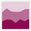
Figure 2.6
Histogram and stacked area 100% chart
- How do the volumes of document series change over time?

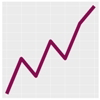
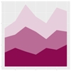
Figure 2.7
Histogram, line plot and stacked area chart
- What is the time correlation between volumes of document series?
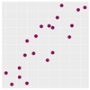
Figure 2.8
Scatter plot
- What is the distribution of document counts among the creators of documents?

Figure 2.9
Histogram and pie chart
- What is the distribution of document counts among the creators of documents and across series?
Figure 2.10
Heat map
- What is the distribution of types of records in a collection?

Figure 2.11
Pie chart and bar chart
- What are frequencies of specific terms in a given collection?


Figure 2.12
Word cloud, bar chart, and pie chart
- Where or from whom do the collection documents come?
Map
- How has collection developed over time?

Figure 2.14
Histogram
- What terms from controlled vocabularies are the most frequently used?


Figure 2.15
Bar chart and pie chart
- How have controlled vocabularies evolved?


Figure 2.16
Histogram and line plot
- How has the frequency of missing values in metadata evolved over time?


Figure 2.17
Histogram and line plot
- What common metadata inconsistencies are detectable in graphs (misspelled names of categories: authors, series names, etc.)?

Figure 2.18
Histogram
Choosing Plot Types
It is worth keeping in mind that current visualization techniques have their own legacy from business applications and governmental and administrative organizations, as well as from natural and social sciences since the eighteenth century.12 Common charts, graphs, and diagrams have long been used by businessmen, administrators, and scientists to summarize quantitative information and translate it into graphic formats for a better grasp. Visualization has been both an analytical tool for exploring data and a communication tool for informing and persuading. While graphs illustrate data and may show their hidden patterns, they might also supply an interpretation of data. Choosing the right plot for your data may help to convey the right message.
In principle, plots are used to show patterns and trends in data. Andrew Abela created a typology of charts organized along four fundamental purposes for visualization, namely, comparison, distribution, composition, and relationship.13 His typology provides a good starting point for selecting plots that may fit a particular task relevant for visualizing digital collection data:
- To compare variables, bar plots, dot plots, and line plots seem to be good choices.
- Bar plots present the relationships between categoric and numeric variables.
- Dot plots show a numeric metric for each category.
- Line plots display the evolution of numeric variables.
- To show a distribution of data, you can employ bar and line histograms, box plots, and rose plots.
- Histograms show the frequency of numeric variables.
- Box plots summarize the distributions of numeric variables with median and quartiles.
- Rose plots show the cyclical distribution.
- To determine the composition of data, you may use stacked bar plots, stacked area plots, pie charts, and tree maps.
- Stacked bar charts show variations among many variables.
- Stacked area charts present multiple variables changing over an interval.
- Pie charts show numerical proportions among subsets of data.
- Tree maps display tree-structured hierarchical data as a set of nested rectangles.
- To explore relationships among variables, you may use scatter plots, bubble plots, and heat maps.
- Scatter plots reveal correlations between two numeric variables.
- Bubble plots show patterns and correlations among multiple numeric variables.
- Heat maps display a general view of multiple variables through color variations.
There are numerous resources that may guide you in selecting the best plot for your needs. For example, The Data Visualisation Catalogue, developed by Severino Ribecca, provides an extensive selection of diagrams, graphs, charts, and maps organized by multiple data visualization functions. Similarly, The Visualization Universe, a project developed by Anna and Mark Vital from Adioma Infographic Labs and Aleksander Vushkan in collaboration with Google News Lab, offers brief introductions to over fifty-five charts, along with a comprehensive list of books on data visualization and specialized tools. Likewise, Chartopedia, created by AnyChart LLC, introduces numerous chart types in various usage categories. Last but not least, From Data to Viz, a project created by Yan Holts and Conor Healy, offers a decision tree based on data formats and recommends various graphic possibilities for representing the formats. In addition to an overview of graph types, the site provides tips on using graphs along with the code for creating plots in a few programming languages, including R, Python, and D3.js. As I mentioned earlier, data visualization is a rapidly developing field that provides a wide range of resources and support to novices and experts alike. It is just a matter of taking on this new and exciting challenge.
What to Visualize
What to visualize depends on a combination of various elements. First, consider the content of a collection and think about what aspects of the collection could be of interest to its users, either library patrons or collection curators. For example, is it useful to provide a visual overview of the collection in addition to having a written description on the collection’s landing page? Can visuals reveal patterns and details about the collection that otherwise would remain hidden? Would visual interactive features provide additional insights into the collection?
Another consideration involves examining a collection’s data along with associated metadata in order to assess whether the information that you seek to visualize can indeed be extracted from the data. For example, can you show a network of professional relationships of a scientist based on the information contained in his papers?
The final concern is how to express extracted information in a graphic form. For instance, do you draw a network diagram for a scientist and her professional relationships based on the names of people that she corresponded with? Or perhaps you can use the information from envelopes about locations that letters were sent from and draw a map.
In selecting possible topics for visualizations that are to enhance your digital collections, it is important to know the limits of your data and metadata. But this knowledge should not stop you from experimenting with data. On the contrary, the process that leads to visualizations is exploratory in its very nature. Good and bad charts equally provide a lot of information about your data and metadata that you can use to improve your collections and make them more useful and appealing to library users.
The next chapter focuses on visualizations created for the NMSU Department of Astronomy’s Clyde W. Tombaugh Papers digital collection hosted at the NMSU Library. The selection of graphs was informed by specific questions about the collection content and its development.
Notes
- “TIOBE Programming Community Index for July 2020,” accessed July 6, 2020, https://www.tiobe.com/tiobe-index/ (July 2020 information removed from page). TIOBE is a measure of popularity of a given programming language.
- “What Is Free Software?” GNU Operating System, accessed July 6, 2020, https://www.gnu.org/philosophy/free-sw.html.
- Kurt Hornik, “2.1 What Is R?” in “Frequently Asked Questions on R, Version 2020-02-20,” accessed July 6, 2020, https://cran.r-project.org/doc/FAQ/R-FAQ.html#What-is-R_003f.
- R Journal home page, accessed July 6, 2020, https://journal.r-project.org/.
- Jupyter home page, accessed July 7, 2020, https://jupyter.org/; RStudio home page, accessed July 7, 2020, https://rstudio.com/.
- J. D. Long and Paul Teetor, R Cookbook: Proven Recipes for Data Analysis, Statistics and Graphics (Sebastopol, CA: O’Reilly Media, 2019), 10–11.
- Richie Cotton, “Data Visualization for Everyone,” course on DataCamp platform, accessed December 2019, https://learn.datacamp.com/courses/data-visualization-for-everyone (requires sign-in); Jonathan Cornelissen, “Introduction to R,” course on DataCamp platform, accessed November 2019, https://learn.datacamp.com/courses/free-introduction-to-r (requires sign-in); Matt Dowle, “Data Manipulation with data.table in R,” course on DataCamp platform, accessed January 2020, https://learn.datacamp.com/courses/data-manipulation-with-datatable-in-r (requires sign-in); Rick Scavetta, “Data Visualization with ggplot2 (Part 1),” course on DataCamp platform, accessed December 2019, https://learn.datacamp.com/courses/data-visualization-with-ggplot2-1 (requires sign-in).
- OpenRefine home page, accessed June 14, 2020, https://openrefine.org/; Edwin de Jonge and Mark van der Loo, An Introduction to Data Cleaning with R, discussion paper (The Hague: Statistics Netherlands, 2013), https://cran.r-project.org/doc/contrib/de_Jonge+van_der_Loo-Introduction_to_data_cleaning_with_R.pdf.
- Hadley Wickham, “A Layered Grammar of Graphics,” Journal of Computational and Graphical Statistics 19, no. 1 (2010): 3–28; Hadley Wickham, “Tidy Data,” Journal of Statistical Software 59 (2014), https://vita.had.co.nz/papers/tidy-data.html.
- Leland Wilkinson, Grammar of Graphics, 2nd ed. (New York: Springer, 2005).
- Wickham, “Tidy Data.”
- Anne Burdick, Johanna Drucker, Peter Lunenfeld, Todd Presner and Jeffrey Schnapp, Digital Humanities (Cambridge, MA: MIT Press, 2012); Daniel Rosenberg and Anthony Grafton, Cartographies of Time: A History of the Timeline (New York: Princeton Architectural Press, 2010).
- Andrew Abela, Advanced Presentation by Design: Creating Communication That Drives Action, 2nd ed. (San Francisco: Pfeiffer, 2013); Andrew Abela, The Extreme Presentation Method (website), accessed June 20, 2020, https://extremepresentation.com/.
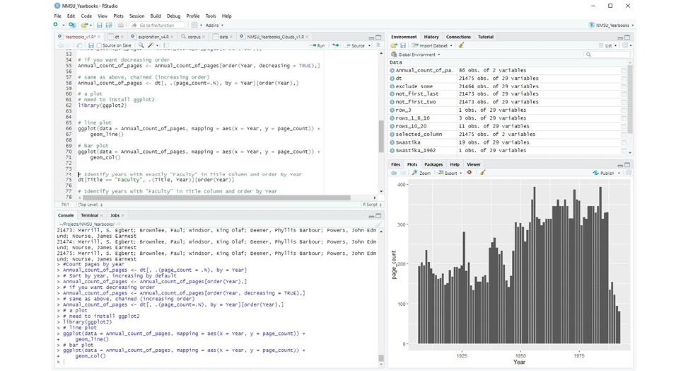
Figure 2.1
RStudio integrated development environment (IDE)
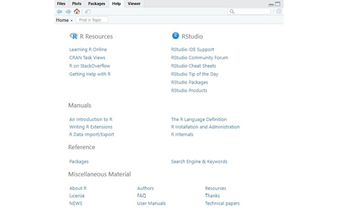
Figure 2.2
RStudio Help tab resources
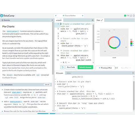
Figure 2.3
DataCamp learning environment
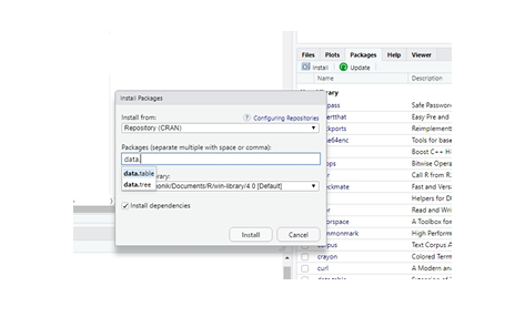
Figure 2.4
RStudio installing R packages option